
Adding a new Builder Component
Builder Components are auto-detected and displayed to the experimenter as icons (in the right-most panel of the Builder interface panel), so adding new ones is fairly straightforward. You can add Components directly to PsychoPy (see Working on a new feature, if this doesn’t mean anything to you then see Using the repository) or create a plugin which adds them via an entry point.
Creating a Component class
Components in PsychoPy are Python classes, so creating a Component is just a case of creating the right kind of class. In order to be recognised as a Component, your class needs to be a subclass of BaseComponent. You can do this via BaseComponent directly:
from psychopy.experiment.components import BaseComponent

class MyNewComponent(BaseComponent):
    pass
Or via another class which itself is a subclass of BaseComponent (such as BaseVisualComponent or BaseDeviceComponent):
from psychopy.experiment.components import BaseVisualComponent, BaseDeviceComponent

class MyNewDeviceComponent(BaseDeviceComponent):
    pass

class MyNewVisualComponent(BaseVisualComponent):
    pass
In order to be detected by the PsychoPy® Studio/Standalone app, your Component class needs to either:
Be defined in a .py file in its own folder in the the folder psychopy/experiment/components within the PsychoPy library (if you’re contributing directly to PsychoPy)
Be connected to the module
psychopy.experiment.componentsby an entry point (if you’re writing a plugin)
Both apps use the same function in the PsychoPy® library to get a list of all Components, so you can test whether your Component will be detected without having to actually start either app by running the following:
from psychopy.experiment import getAllComponents

print(
    getAllComponents()
)
If your Component is configured correctly, you should see its name in the output.
Adding parameters
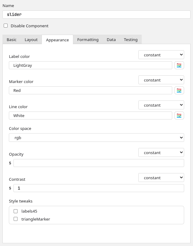
The controls that you see in PsychoPy® Studio/Standalone are created based on the value of the .params attribute of your Component.
This attribute should be a dict, with each key being a Param object. These objects can be created with the following values:
val: A default value for this param
valType: This tells PsychoPy® how to write the value of this param when compiling the experiment code. Note that, if the param’s value begins with a $, it will always be treated as code regardless of valType. Options are:
str: A string, will be compiled with “ around itextendedStr: A long string, will be compiled with “ around it and linebreaks will be preservedcode: Some code, will be compiled verbatim or translated to JS (no “)extendedCode: A block of code, will be compiled verbatim or translated to JS and linebreaks will be preservedfile: A file path, will be compiled like str but will replace unescaped \ with /list: A list of values, will be compiled like code but if there’s no [] or () then these are added
inputType: This tells PsychoPy® how to represent the parameter in the Builder; what kind of control to show for it. Options are:
single: A single-line text controlmulti: A multi-line text controlcolor: A single-line text control with a button to open the color pickersurvey: A single-line text control with a button to open Pavlovia surveys listfile: A single-line text control with a button to open a file browserfileList: Several file controls with buttons to add/removetable: A file control with an additional button to open in Excelchoice: A single-choice control (dropdown) whose choices are listed inallowedValsandallowedLabelsdevice: A single-choice control (dropdown) whose choices are the devices from DeviceManager which match the classes listed inallowedValsmultiChoice: A multi-choice control (tickboxes)richChoice: A single-choice control (dropdown) with rich text for each optionbool: A single checkbox controldict: Several key:value pair controls with buttons to add/remove fields
allowedVals: For params with a fixed set of options, this tells PsychoPy® what the values of those options are. These should not be translated, as they are the actual values used in code.
allowedLabels: A list of labels corresponding to the values in
allowedValswhich tells PsychoPy® what to display each option as. These can (and should) be translated, as they are not used in code.categ: Which tab this param should appear in, leave as
Noneto have the param appear at the top of the Component dialog (use this sparingly; it is best saved for core functionality like the Component name and disabled control)label: What to label this param as. Keep in mind, the param will still be referred to in code by its key, this is just for the graphical interface of Builder.
hint: The hint shown when this param’s label is hovered over.
updates: When the value of this param should be set, should be one of:
constant: Value is set just the once
set every repeat: Value is set at the start of each Routine
set every frame: Value is set each frame
allowedUpdates: Which values for
updatesthe user is allowed to choose (leave as None to hide the control)
So, for example, the parameter in the Keyboard Component which determines whether keypresses should be registered on press or on release looks like this:
self.params['registerOn'] = Param(
    # starts off as "press"
    "press",
    # written to code as a string
    valType="str",
    # shown in Builder as a dropdown menu
    inputType="choice",
    # has two options...
    allowedVals=["press", "release"],
    # ...which should be labelled as follows
    allowedLabels=[_translate("Press"), _translate("Release")],
    # shown in the "Basic" tab
    categ="Basic",
    # the label shown in Builder
    label=_translate("Register keypress on..."),
    # the tooltip when hovered over
    hint=_translate(
        "When should the keypress be registered? As soon as pressed, or when released?"
    ),
    # set just the once, when the Keyboard is created
    updates="constant",
    # there is no option to set each repeat/frame
    allowedUpdates=None
)
Many params will already exist by virtue of subclassing. For example, the name param is always present as it’s added by BaseComponent, and the pos and size params are always present on subclasses of BaseVisualComponent for the same reason.
Translating labels
PsychoPy has a team of volunteer translators who provide translations for all labels in the PsychoPy apps. To use an existing translation (or make sure your label is picked up by the code which tells the team what to translate), you need to import the _translate function from psychopy.localization and wrap any string in the following:
_translate("My label")
This should be done on labels and tooltips which are presented to the user, never on values which are used in code, as translating a string could break code further down the line (e.g. if you had code which said if fruit == "banana": and fruit was translated into another language, this statement would always be False). Also, as strings are submitted for translation before interpretation, any string formatting needs to be done after _translate, so for example:
# CORRECT
_translate("The value is {}").format(someValue)
# INCORRECT
_translate("The value is {}".format(someValue))
As in the former example, translaters can translate "The value is " and leave {} as is. Whereas in the latter, the string to translate would depend on the value of someValue, so the translation would only cover the default value.
Writing code
What a Component is, at its core, is something which takes parameter values and returns Python or JavaScript code. It does this by defining a set of functions which write code at certain points in an experiment, using the values of its parameters to construct Python formatted strings. Some of this code is already defined by the base class you’re subclassing (e.g. if you’re creating a subclass of BaseVisualComponent, then it will already know how to draw itself each frame according to start/stop parameters), but generally you will want to overwrite some or all of these to get the desired behaviour.
The functions which write a Component’s code are roughly equivalent to the tabs of a _code:
writePreCode/writePreCodeJS: Written before the experiment starts (Before Experiment)writeInitCode/writeInitCodeJS: Written at the start of the experiment (Begin Experiment)writeRoutineStartCode/writeRoutineStartCodeJS: Written at the start of this Component’s Routine (Begin Routine)writeFrameCode/writeFrameCodeJS: Written each frame of this Component’s Routine (Each Frame)writeRoutineEndCode/writeRoutineEndCodeJS: Written at the end of this Component’s Routine (End Routine)writeExperimentEndCode/writeExperimentEndCodeJS: Written at the end of the experiment (End Experiment)
All of these functions take an input argument buff, which is the text buffer to which the current experiment is being written. You can therefore write your code to this buffer by calling:
buff.writeIndentedLines(code)
You will also need to use this buffer to manage indenting:
buff.setIndentLevel(<number of indentations>, relative=<True/False>)
The BaseComponent class also offers some helper functions which you can use to make your code writing a bit easier:
writeStartTestCode(self, buff, extra="")/writeStartTestCodeJS(self, buff, extra=""): Writes code to check whether the Component needs to start, based on its start params, leaving the relevantifstatements open. The returned value is how manyifstatements were left open, so after writing whatever you would like to happen on the starting frame, you will need to callbuff.setIndentLevel(-<returned value>)(and write some}’s in JS) to return to normal after. Use the optional argumentextrato add additional conditions to check for (e.g.and someLimitingFactor == True).writeStopTestCode(self, buff, extra="")/writeStopTestCodeJS(self, buff, extra=""): Same aswriteStartTestCodebut rather than checking whether the Component is ready to start, checks whether it is ready to stop.writeActiveTestCode(self, buff, extra="")/writeActiveTestCodeJS(self, buff, extra=""): Same aswriteStartTestCodeandwriteStopTestCodebut rather than checking whether the Component is ready to start or stop, checks whether it has started and is yet to stop.writeParamUpdates(self, buff, updateType)/writeParamUpdatesJS(self, buff, updateType): Writes the necessary updates to params if their update type matches what is given. This is already called bywriteActiveTestCodeand in the default behaviour ofwriteRoutineStartCode.getPosInRoutine(self): Gets the position of this Component in its Routine; useful for choosing what value to give fordepthwith visual Components.
Using parameters
The Param class has some clever functions for handling turning itself into a string (__str__), which means you don’t have to worry about getting and processing the value of the parameter yourself. Simply pass it to a Python format function, and it will write itself correctly according to its valType attribute. Examples of how you might do this:
# using %s formatting
code = (
    "%(name)s = visual.SomeStim(\n"
    "    name='%(name)s',\n"
    "    pos=%(pos)s,\n"
    ");"
) % self.params
# using .format
code = (
    "{name} = visual.SomeStim(\n"
    "    name='{name}',\n"
    "    pos={pos},\n"
    ");"
).format(**self.params)
# using f strings
code = (
    f"{self.params['name']} = visual.SomeStim(\n"
    f"    name='{self.params['name']}',\n"
    f"    pos={self.params['pos']},\n"
    f");"
)
It is worth noting that in writeInitCode, parameters may need to have different values, as if a parameter’s value is set each frame or set each repeat then it will need to be initialised as a safe default. To get these defaults, you can use the function psychopy.experiment.components:getInitVals, which will return a dict which you can use in place of self.params.
Name space
There are several internal variables (i.e. names of Python objects) that have a specific, hardcoded meaning within xxx_lastrun.py. You can expect the following to be there, and they should only be used in the original way (or something will break for the end-user, likely in a mysterious way)
Name |
Use |
|---|---|
win |
The window |
t |
Time (s) since the Routine began |
continueRoutine |
Boolean which will end the Routine on next frame flip if set to False |
logging |
PsychoPy’s |
thisExperiment |
|
currentLoop |
Trial handler object representing the current loop, if any |
Other names will also get derived from user-entered names, like trials (name of a loop) –> thisTrial.Handling of variable names is under active development, so this list may well be out of date. (If so, you might consider updating it or posting a note to the PsychoPy® Discourse developer forum.)
Creating an icon
The best way to make an icon which will work in both PsychoPy Studio and PsychoPy Standalone is to use a vector editor like Affinity, Inkscape or Adobe Illustrator which allows you to export your icon to whatever file format is required. While the appearance of your Component icon is totally up to you, we recommend using thick grey lines with curved corners and limiting colors to just red and blue.
For PsychoPy Studio
As PsychoPy Studio uses modern web-based technologies, icons for PsychoPy Studio are .svg files. This makes them small, fast to load, infinitely scalable and theme responsive. The app interface of PsychoPy Studio is Chromium-based, so if you can open your icon in Google Chrome (or other Chromium-based browsers) then it should look the same in PsychoPy Studio.
Because .svg is a text-based format, you can make your icon theme-responsive by opening the exported .svg file in a text editor and replacing the color values (e.g. #F2545B) with named CSS variables (e.g. var(--red)). See below for the color names used by PsychoPy Studio and what color they correspond to in PsychoPy Light and PsychoPy Dark themes.
Name |
PsychoPy Light |
PsychoPy Dark |
|---|---|---|
–red |
#F2545B |
#F2545B |
–purple |
#C3BEF7 |
#C3BEF7 |
–blue |
#02A9EA |
#02A9EA |
–green |
#6CCC74 |
#6CCC74 |
–yellow |
#F1D302 |
#F1D302 |
–orange |
#EC9703 |
#EC9703 |
–base |
#FFFFFF |
#75757d |
–mantle |
#F2F2F2 |
#75757d |
–crust |
#E4E4E4 |
#57575f |
–overlay |
#D6D6D6 |
#484850 |
–outline |
#66666E |
#ACACB0 |
–text |
#242427 |
#FFFFFF |
–hltext |
#FFFFFF |
#242427 |
In general, PsychoPy icons stick to just --red, --blue and --outline, so your icon will best fit in with existing Components if you limit your palette to these three colors.
Once you have a .svg file ready to add, you can assign it to your Component by setting the class attribute iconSVG of your Component class to be the file’s path. The easiest way to do this is to put it in the same folder as your Component and set the attribute to:
pathlib.Path(__file__).parent / '<file name>.svg'
For PsychoPy Standalone
As PsychoPy Standalone was written in wxPython, adding icons for this app means exporting a .png file for each of the three app themes: Light, dark and classic. These should all be 48x48px, though in order for your Component to look correct on an Apple Retina screen you should also export it as 96x96px with @2x at the end of the file stem (just before .png). Many image editors will include this as an export preset.
Light and dark icons should be broadly the same, only with a different shade of grey for outlines so as to be more visible on light/dark background. PsychoPy icons generally stick to the following colors for each theme:
PsychoPy Light |
PsychoPy Dark |
|---|---|
#F2545B |
#F2545B |
#02A9EA |
#02A9EA |
#66666E |
#ACACB0 |
The classic theme exists for compatability with PsychoPy’s old (pre-2020) look, so icons for that theme should be drawn from the Crystal icon pack. If none meet your needs, you can create a copy of your dark mode icon, as this will be visible on either background.
Icons should be sorted into folders (called light, dark and classic) by theme. To connect them to your Component, set the iconFile attribute of the Component class to be the file path of the icon without the theme subfolder or @2x. For example, if your file structure looked like this:
-> myComponent
  -> light
    -> myComponentIcon.png
    -> myComponentIcon@2x.png
  -> dark
    -> myComponentIcon.png
    -> myComponentIcon@2x.png
  -> classic
    -> myComponentIcon.png
    -> myComponentIcon@2x.png
Then you would set icon as:
Path(__file__).parent / 'myComponentIcon.png'